Docs
Image
Use the image shortcode to display a responsive image with a specific aspect ratio.
Overview
Use the image shortcode to display a responsive image with a specific aspect ratio. The source link can refer to either an image available in the /assets/img folder of your site or a public web location. The shortcode renders the image as a so-called image set to optimize the image for different screen sizes and resolutions. Behind the scenes, Hugo renders the images in WebP format and stores them in a local folder (resources or public). The images are processed using the quality setting specified in the [imaging] section of the main config file (defaults to 75). Supported image types are .png, .jpeg, .gif, .tiff, .bmp, and .webp. A fallback image of type .jpeg is provided for older browsers.
.svg). However, these images are not processed but rather used as is.As an example, the following shortcode displays an image with its original aspect ratio. The image is adjusted for the active color mode. The shortcode processes two images behind the scenes, being img/responsive-light.png and img/responsive-dark.png. Only the image that matches the current color mode is shown.
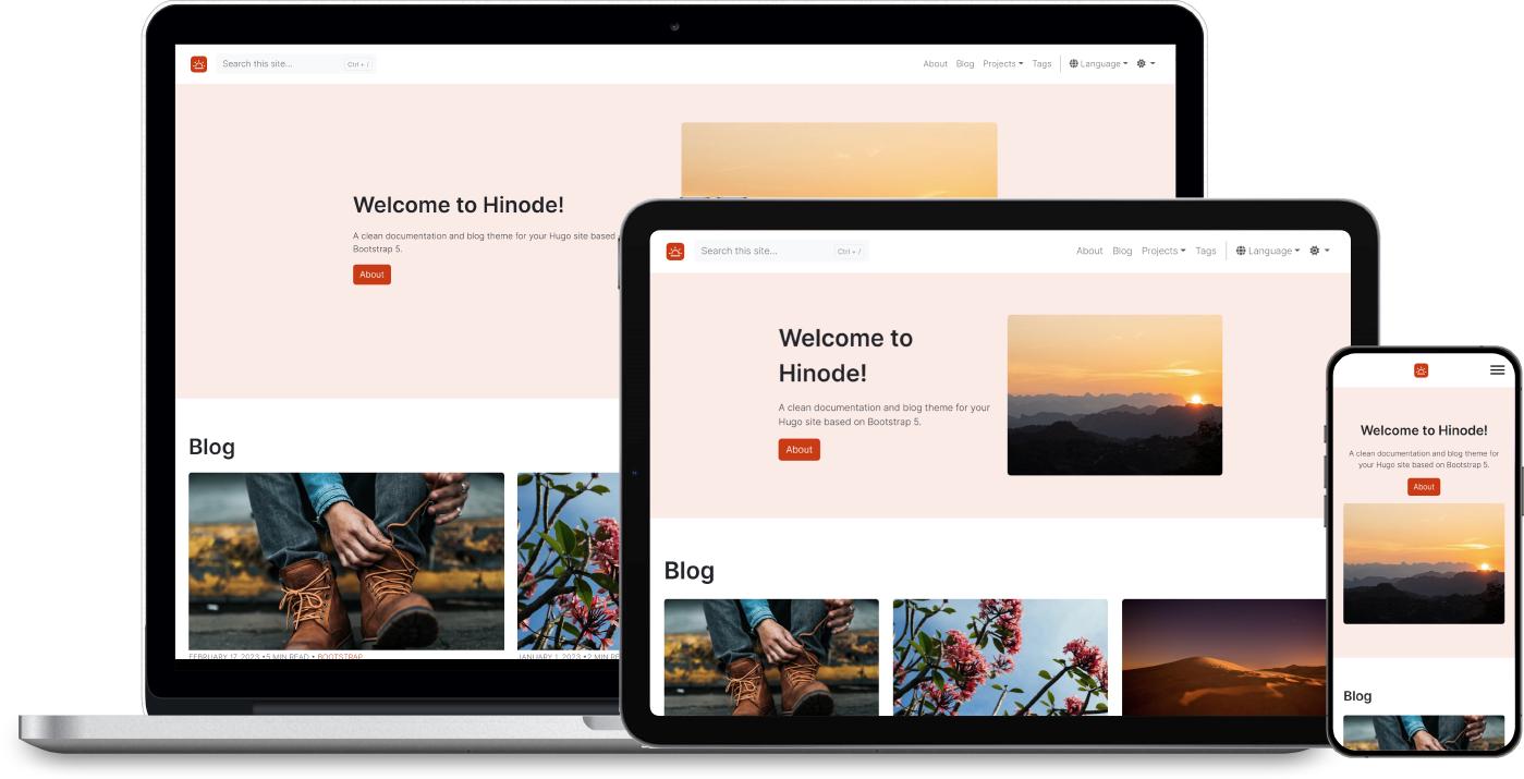
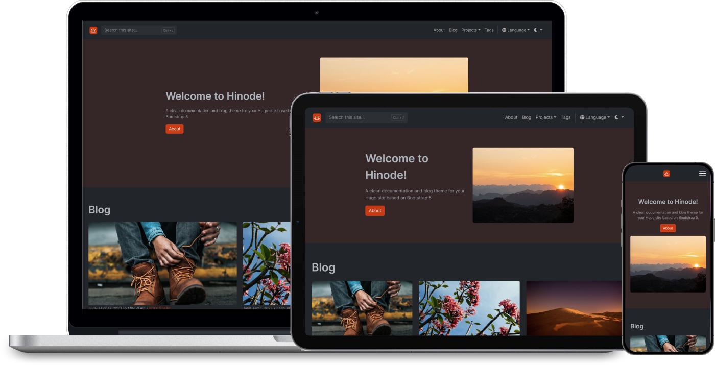
{{< image src="img/responsive.png" mode="true" caption="Image caption" >}}Arguments
The shortcode supports the following arguments:
| Argument | Required | Description |
|---|---|---|
| src | Yes | Required url of the image, e.g. “img/responsive.png”. Images with multiple color modes are expected to have a basename that ends with either -dark or -light. |
| ratio | No | Optional aspect ratio of the image, either “1x1”, “4x3”, “16x9”, or “21x9”. If set, the image is resized and cropped to match the ratio. Vector images are resized instead of cropped to fit within the given dimension. |
| class | No | Optional class attribute of the inner img element, e.g. “rounded”. |
| title | No | Optional alternate text of the image. |
| caption | No | Optional figure caption. |
| mode | No | Optional flag indicating if the image should support color modes. If set, the shortcode searches for images that having a matching color-mode suffix such as light or dark. |
Examples
Change the style of your card with class attributes and shortcode arguments.
Aspect ratio
As an example, the following shortcodes display a centered image with various aspect ratios. The images are wrapped in a div element to resize them relative to the viewport.
Set the ratio to 1x1 for a square aspect ratio.
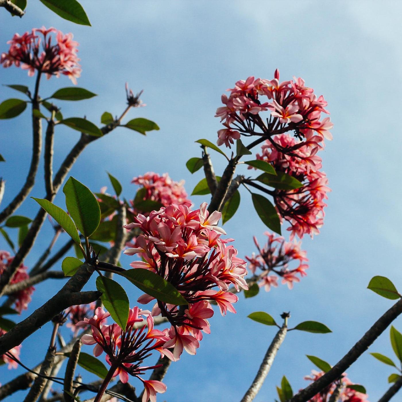
<div class="col-6 mx-auto">{{< image src="img/flowers.jpg" ratio="1x1" >}}</div>Set the ratio to 4x3 for a landscape aspect ratio.
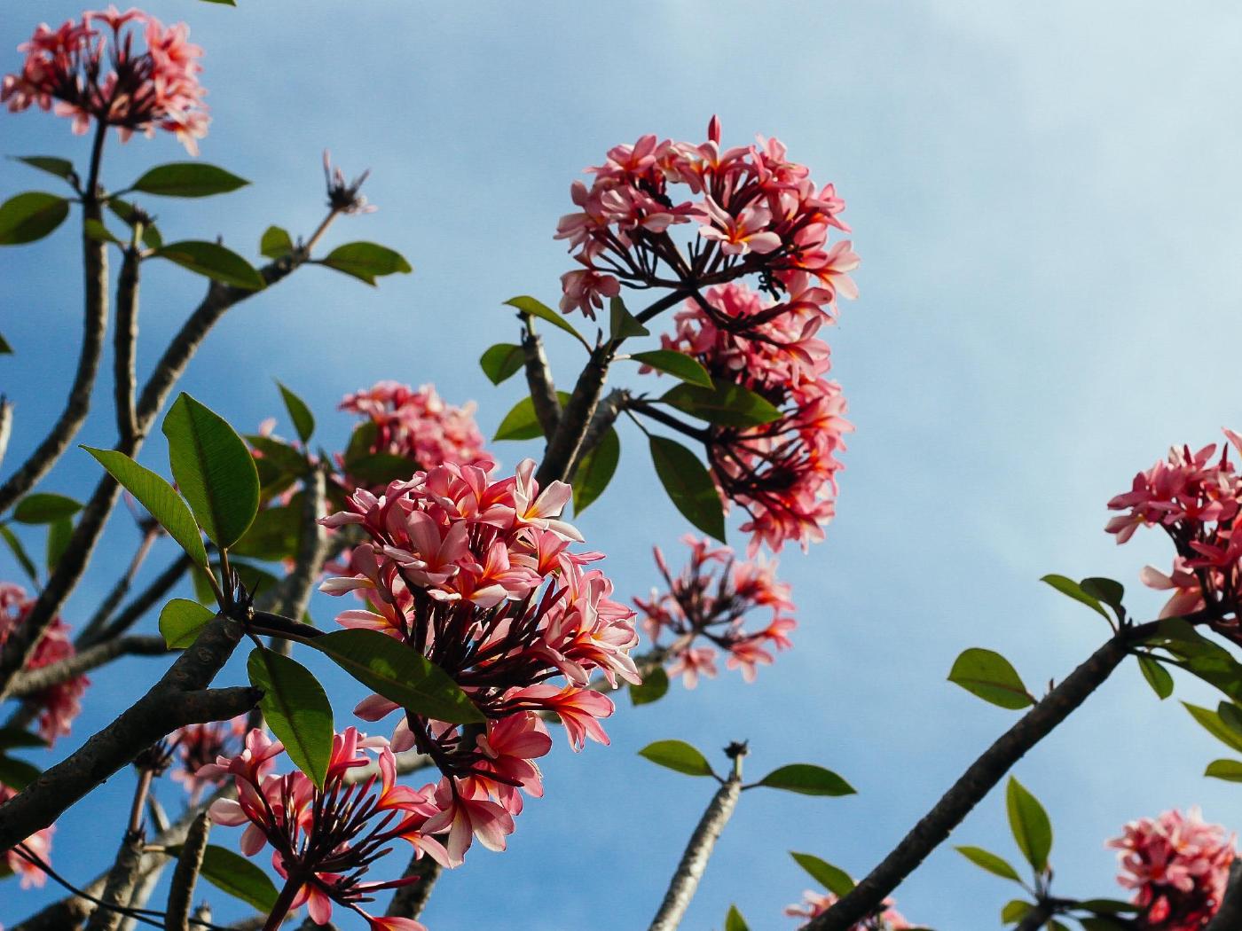
<div class="col-6 mx-auto">{{< image src="img/flowers.jpg" ratio="4x3" >}}</div>Set the ratio to 16x9 for a landscape aspect ratio.
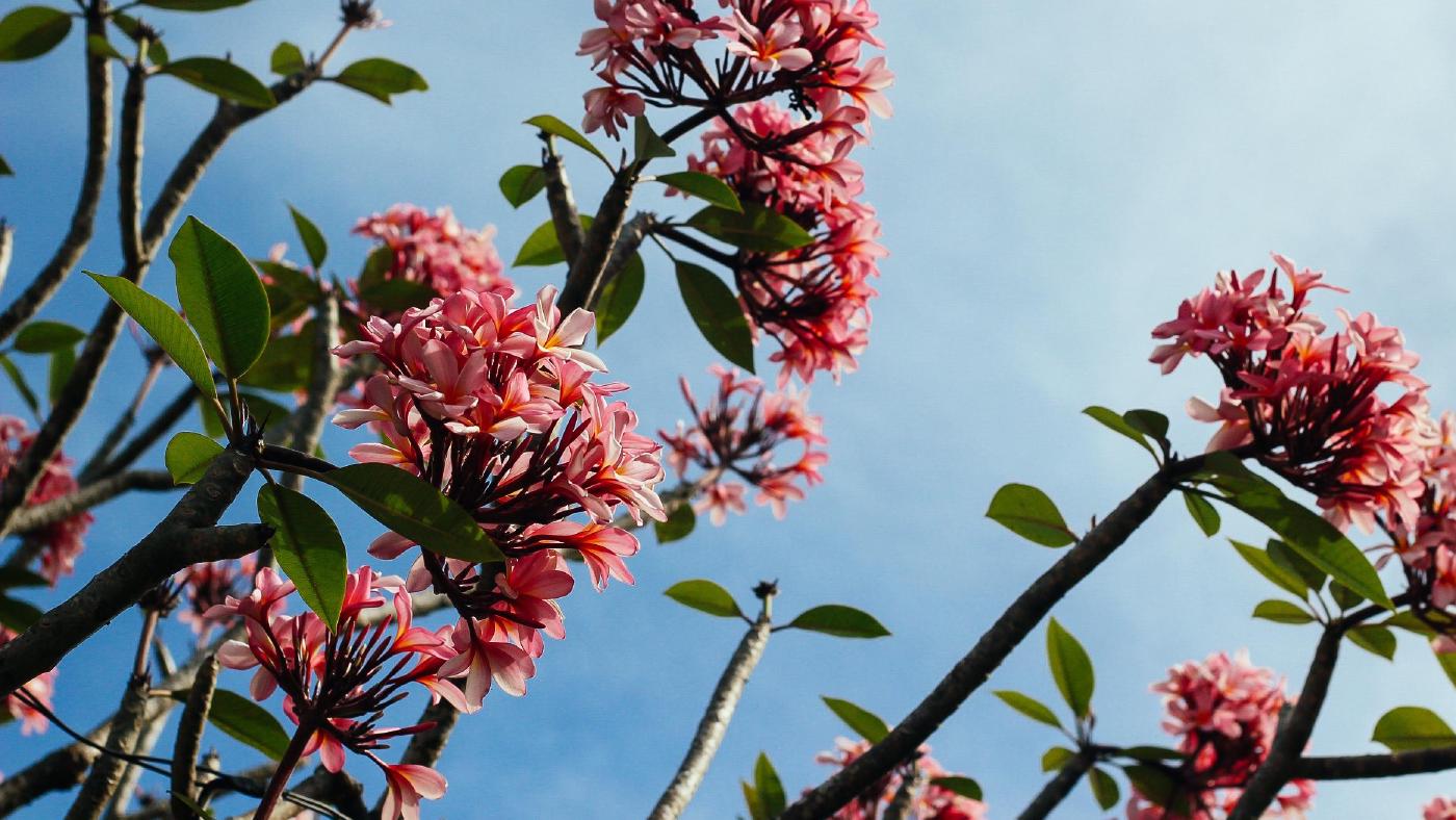
<div class="col-6 mx-auto">{{< image src="img/flowers.jpg" ratio="16x9" >}}</div>Set the ratio to 21x9 for a landscape aspect ratio.

<div class="col-6 mx-auto">{{< image src="img/flowers.jpg" ratio="21x9" >}}</div>Omit the ratio to keep the original aspect ratio.
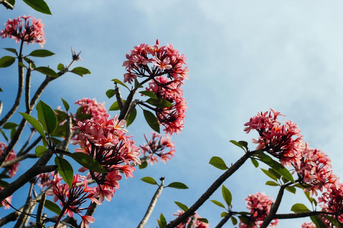
<div class="col-6 mx-auto">{{< image src="img/flowers.jpg" >}}</div>Color mode
Set mode to true to use an image that is color-mode aware. The shortcode processes two images behind the scenes, being img/responsive-light.png and img/responsive-dark.png. Only the image that matches the current color mode is shown.


{{< image src="img/responsive.png" mode="true" >}}Figures
Add a caption to transform the image into a figure with caption.
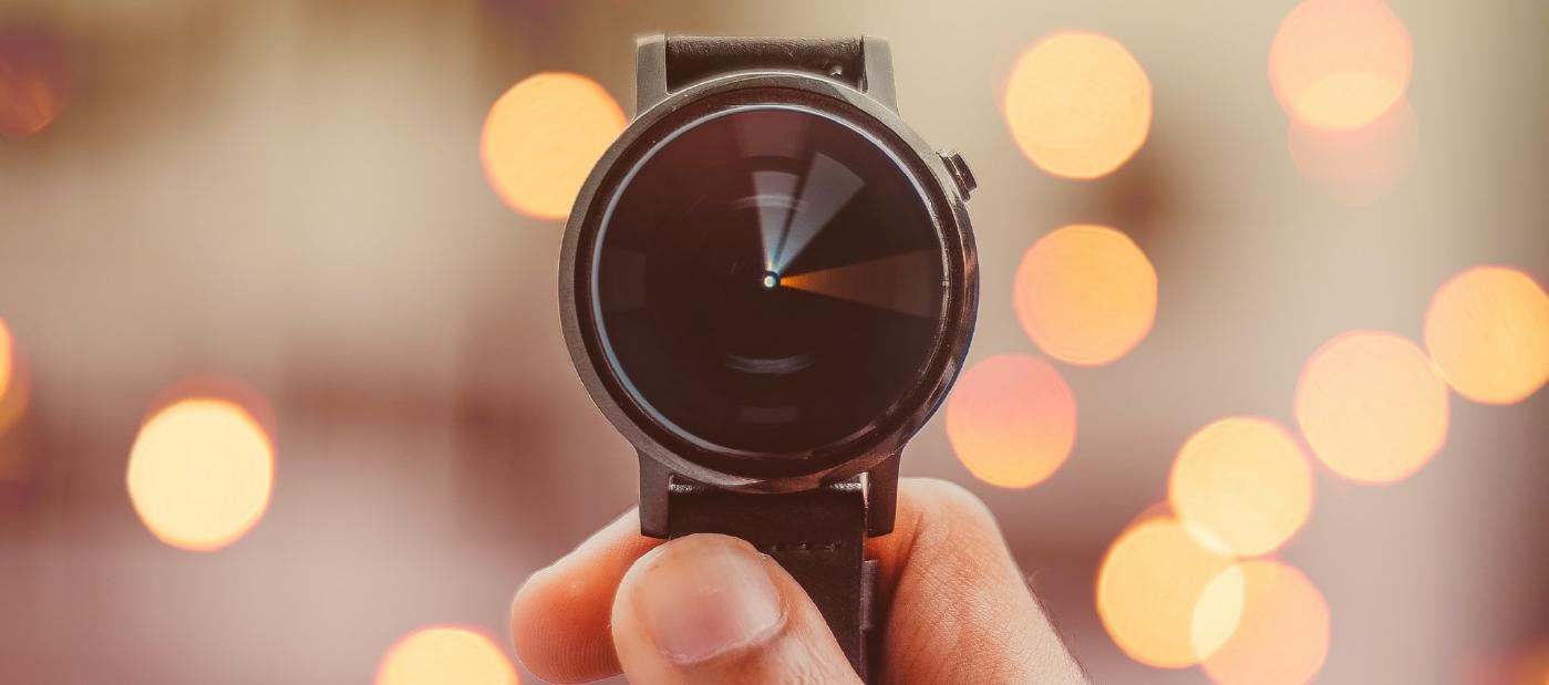
{{< image src="img/watch.jpg" caption="Figure caption" >}}Vector images
The shortcode supports vector images of type .svg too. The shortcode supports the regular arguments, however, vector images are contained instead of cropped when the ratio is set. The next example shows a color-mode aware vector image. The background is set to a contrasting color to illustrate the ratio behavior.
static folder instead of the assets folder. Add a leading / to specify the absolute image location.

{{< image src="/img/logo-mono.svg" mode="true" ratio="21x9" class="bg-primary p-3" >}}